
A couple of weeks ago, the leaks for the new Manchester United kits were starting to come through, with the main finger being pointed at Barcelona. Via the Blaugrana’s official YouTube channel, the Catalans were seen playing Manchester United on Pro Evolution Soccer. For some bizarre reason though, the United home kit wasn’t the classy looking design we’ve seen this season, but rather a more daring motif. Safe to say fans on Twitter weren’t impressed by Adidas’ presumed latest effort, with one fan saying he had seen a similar pattern on a bus seat.
Interestingly, the away kit too was only leaked days before, which was also far from desirable. Described by many to look like a zebra, it’s an unusual design that has been put forward and not what we would come to expect in a football kit generally.
There have also been photos of the rumoured third kit found online, with a solid tank green colour and orange markings. With these designs and the efforts over past couple of seasons, it feels as though Adidas are taking too many liberties with the shirts that we so proudly wear.
Rekindling an Old Flame and Keeping it Fresh
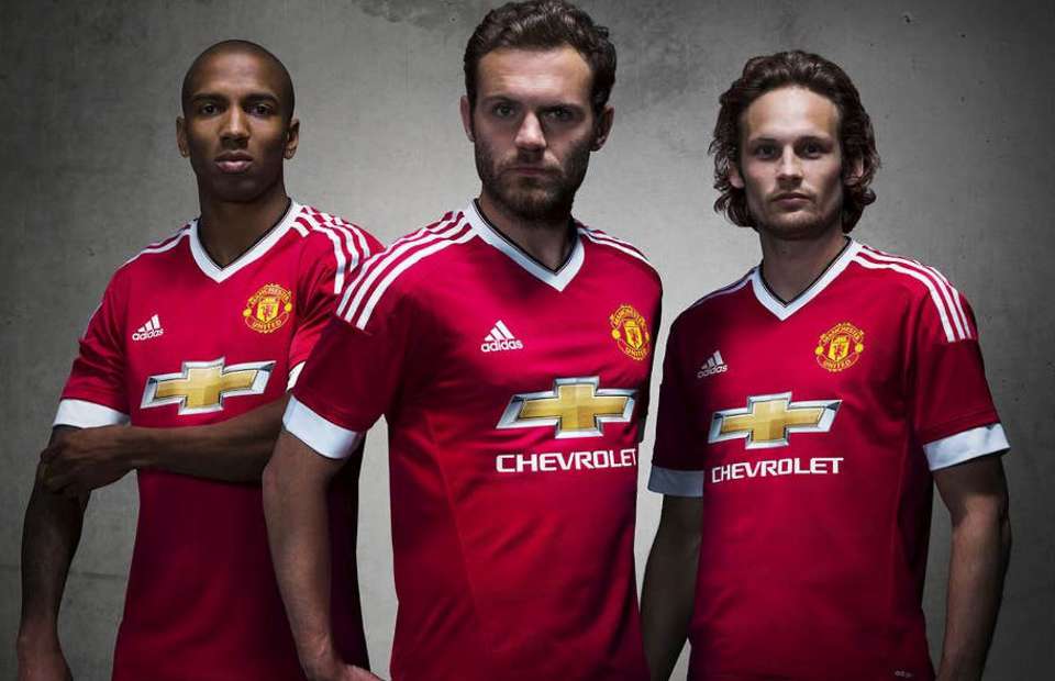
Back in 2015, United fans were delighted that when a record breaking deal was signed with the German giants. The jerseys with Nike had started to feel effortless, not helped by the over use of their template designs; a change was more than welcomed. The first season with Adidas took United back to the early Fergie days, with modernised versions of the home and away kit from the 1988/89 season. The third kit paid tribute to the early Adidas designs as well, showing the famous “snowflake” pattern in the watermark of the black shirt. Unfortunately, it seems that Adidas’ opening effort set a high bar that would be difficult to maintain.
The following season, we were treated to the half and half home shirt, a supposed tribute to the history at Newton Heath. The reaction to this shirt was divisive, but then Nike treated us to the chevron and the tea towel, so it was tolerable compared to some recent efforts. The away kits that season were reasonable efforts; the away had a blue ripple effect jersey, worn in the Europa League victory against Ajax. The third kit was inoffensive; an off-white shirt with dark grey lining and a pattern on the shoulders, it certainly wasn’t a jersey you would queue for upon release.
With the club back in the big time, qualifying the Champions League, Adidas clearly felt that United had to look the part. The 17/18 season seen a simple but classy design, sporting a grandad collar, as we seen Romelu Lukaku scoring for fun in his opening season. The change shirts deviated away from tradition again, but did pay homage to the past. On the away shirt, the snowflake pattern re-emerged in the effect on the black away shirt in one of Adidas’ finer efforts. The third shirt is still out for discussion; some fans loved it, some fans hated it. The first grey shirt that United would wear since the infamous half-time change against Southampton in 1995, there certainly wouldn’t be an issue with players not being able to see each other. Designed by competition winner, Aniello Carotenuto, the shirt features a tapestry effect of the symbolic United Trinity, with the reason that it would “create a bond between teams and the fans”. Maybe this was achieved as the Red Devils would go on to their highest league finish in the post-Fergie era, finishing second.
Poor Effort on Both Parts
The 2018/19 season effort was as disastrous as the season itself. The squad was strengthened with the addition of Fred and Diogo Dalot, along with the hope that Alexis Sanchez will have settled in. However, a much needed centre back was not signed and Mourinho was starting to suffer from his third season syndrome. The actual kit itself matched the performances; awful. Adidas like to add a story to the jerseys they produce, with the 18/19 home shirt paying homage to the Lancashire Yorkshire Railway Workers who originally formed Newton Heath 140 years prior. Fade kits have become a trend in recent years by many manufacturers, but the one adopted by United would go down to be one of the worst in their long history. The fact that the shorts were black (otherwise the fade wouldn’t work) and socks predominantly red, this moves away from the white shorts and black socks that defines the club colours.

The away shirt didn’t fare too much better. Keeping in line with Adidas’ desire to create a story for their design, United were introduced to their first pink jersey. The jersey was acknowledgement of local football newspaper, The Pink, which was a once weekly publication that fans would pick up after matches on a Saturday. Pink is always a contentious colour, but this is possibly one of the better efforts by the German manufacturers. Personally, this is one of my favourites in recent history as this is the jersey worn when Marcus Rashford smashed in the last minute penalty at Parc des Princes; possibly the best moment of the season.
The third kit was blue and in isolation was an elegant navy blue design with a golden trim. Following collaboration with environmental organisation, Parley, Adidas would create the first United shirt that was made from recycled ocean plastic. However, it was disappointing to find it wasn’t a bespoke design, with Real Madrid, Juventus and Bayern Munich using the same style. The template has been further used this season, with Wolves and Cardiff amongst others sporting the design.
Another disaster for the 2018/19 season was the introduction of a “digital fourth kit”. In collaboration with EA Sports, photos started to emerge of Jesse Lingard wearing a jersey that wouldn’t look out of place on Kat Slater. The leopard print was part of a marketing campaign by Adidas and EA Sport, with four teams being chosen; Real Madrid, Bayern Munich, Juventus and United – safe to say United pulled the short straw. What shocked me the most about this jersey was witnessing fans actually wearing this monstrosity at Old Trafford and that people actually parted with money for this.
Blowing Hot and Cold
Adidas made amends moving into the 19/20 season, but quite frankly, it was impossible to create a worse design than it’s predecessor. The plain design with the shielded badge was created to celebrate the 20 year anniversary of the Champions League win in Barcelona, with the minutes of the goals printed on the sleeves. There is some irony that we wouldn’t actually be wearing this in the Champions League, but it is a respectable effort nonetheless.
However, Adidas again let themselves down with the change strips. The designers at Adidas persisted with the animal effect, bringing a snakeskin look to the away kit. Following the final game of the season where United were defeated at home by relegated Cardiff, many fans jested that it was fitting of some of some of the players, Paul Pogba being a central target.
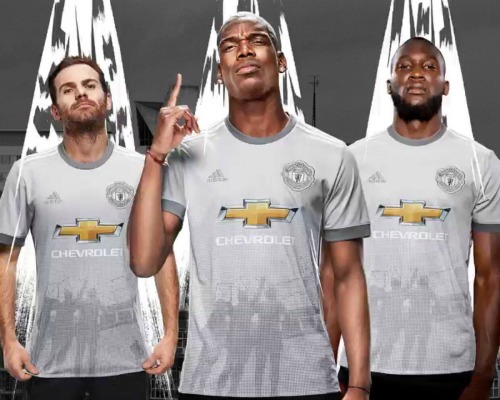
The third kit this season more than makes up for the poor snakeskin attempt. The shirt is said to pay compliment to the 1909 FA Cup winning team, with a watermark of the Manchester Rose patterned into the material. My only criticism of this shirt would be that it feels like a simplified version of the third kit of the 2015/16 season.
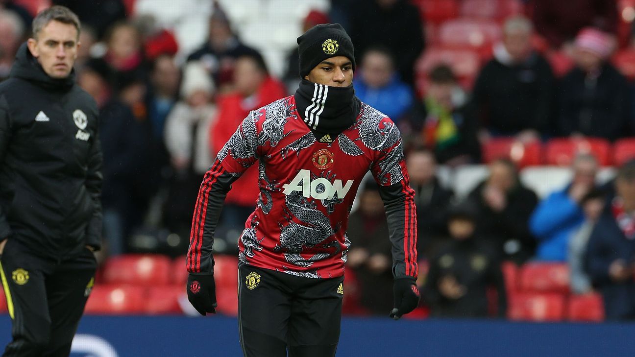
Another corporate move was made this season by the Manchester United hierarchy, taking advantage of the Chinese market with the Dragon shirt to celebrate the Chinese New Year. Unlike the leopard eyesore, this shirt would actually be worn by the players at Old Trafford, in the warm up against Norwich. With the club looking to cash in on a population of over a billion, it’s an excellent marketing ploy, but the shirt itself is still abysmal.
Wait for Change or Time to Let Go?
Like many traditional fans, I’m a huge advocate of the home shirt being red, with white shorts and black socks. As well as the conventional home colours, the away kit is white and the third kit is blue; to me this is Manchester United and these are the colours that we were wearing during some of the club’s most cherished moments. Blue against Benfica in 1968 and white against Barcelona in 1991 being two prime examples and the countless times in Manchester Red. To quote the classic Sean Bean Premier League advert, “It’s part of our history and will be part of our future”.
With coronavirus delaying football for the foreseeable future, Adidas are fortunate to be given the time to make amendments to the leaked designs. With Adidas not having improved since their returning season in 2015/16, it is time for them to go back to basics, away from the outlandish designs that move away from the expectations of fans alike. If this seems too difficult a task, then maybe it’s time shake hands and say thank you for your efforts.
READ MORE: Gossip: Manchester United make contact with German striker